Beyond Beige: The Colour Revolution in Scandinavian Design
When you walk into a contemporary design studio in Copenhagen or Stockholm, something shifts. The walls are not white. They are not grey. There is colour here, a striking celadon green on furniture, a vivid yellow storage box, a coral accent that somehow coexists with quietness. And yet the space does not feel chaotic. It does not assault you.
This is not what we were told Scandinavian design should be.
For two decades, we inherited a particular interpretation of Nordic design. White walls. Grey linens. The careful absence of colour. We were told that this was restraint. That this was simplicity. That this was what created calm. We believed it because the logic was seductive: if chaos comes from stimulation, then surely peace comes from emptiness.
But the designers reshaping Scandinavian design right now understand something we forgot. Emptiness and simplicity are not the same thing.
What Scandinavian Design Actually Was
To understand the current shift, you must go back further than the minimalist interpretation that dominated for the last two decades.
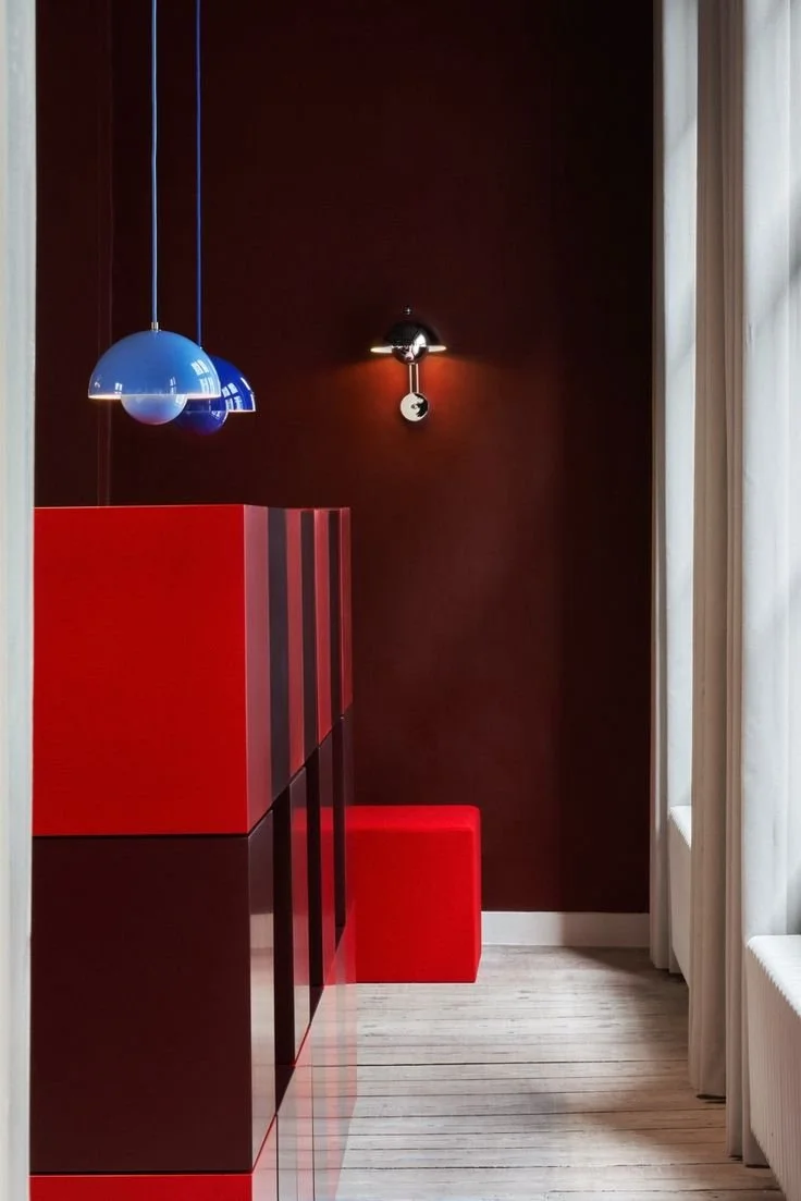
The original Scandinavian designers: the craftspeople, the architects, the makers across Sweden, Denmark, Norway understood colour. In long Nordic winters, when daylight disappears by three o'clock and the darkness lasts for months, colour was not a luxury. A deep red wall was not decorative. It was psychological warmth. A particular blue was not arbitrary. It connected the interior to the fjord, to landscape, to light. These were colours chosen with precision because they served a purpose.
That purpose was simple: to make spaces feel alive. To support the people living in them. To acknowledge that humans need beauty alongside function.
Somewhere in the translation of Nordic design into a global aesthetic, this understanding was lost. The minimalist interpretation became dominant because it was easier to reproduce, to market, to understand. Emptiness is simpler than intention. But it is not the same thing.
The Distinction That Matters
Contemporary Nordic designers are reclaiming the difference between emptiness and intention.
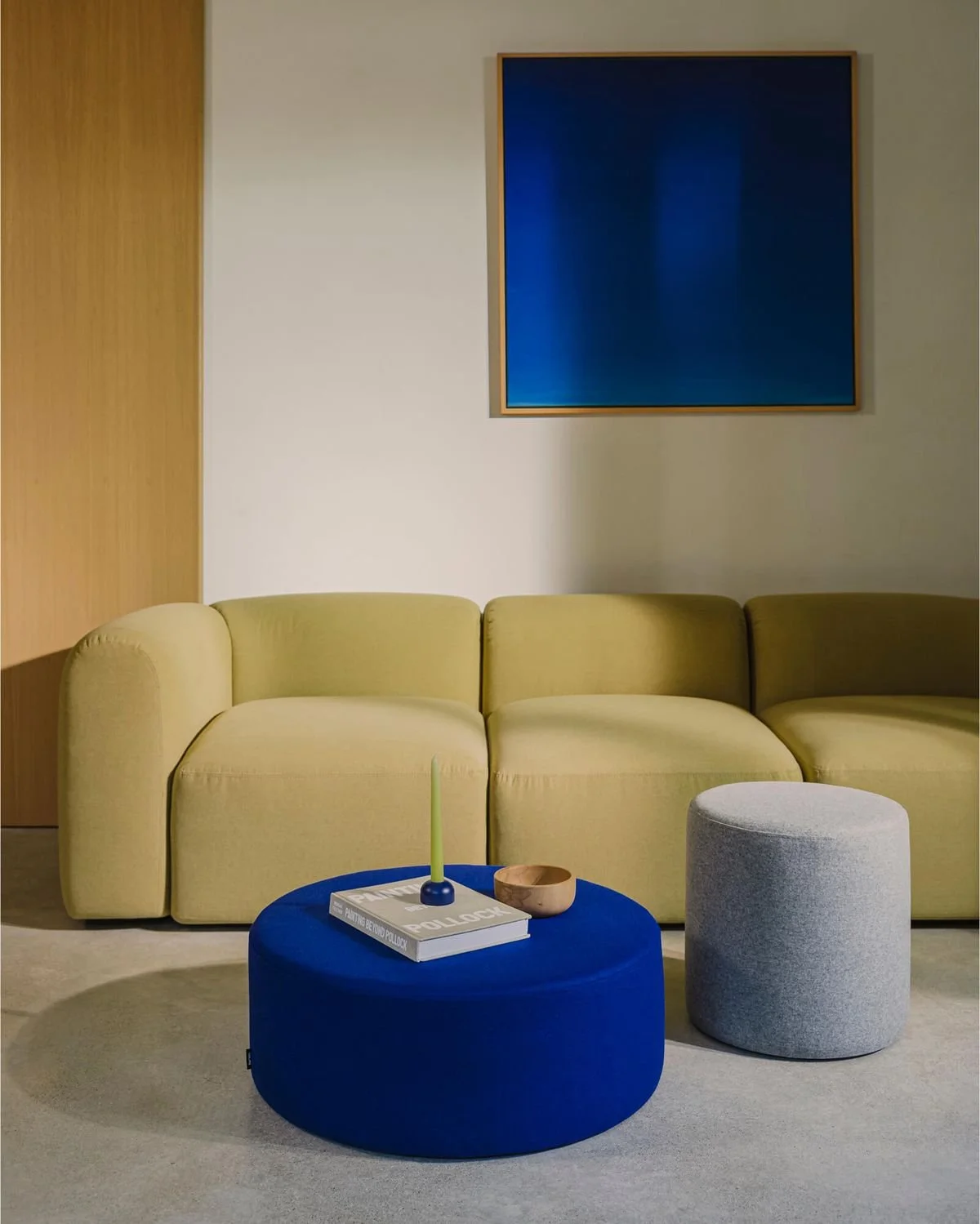
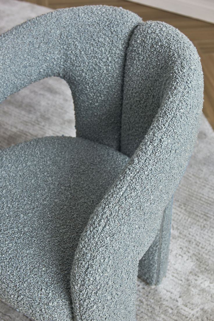
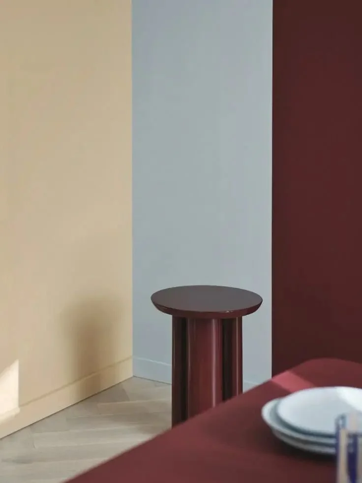
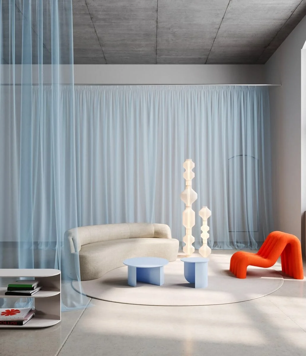
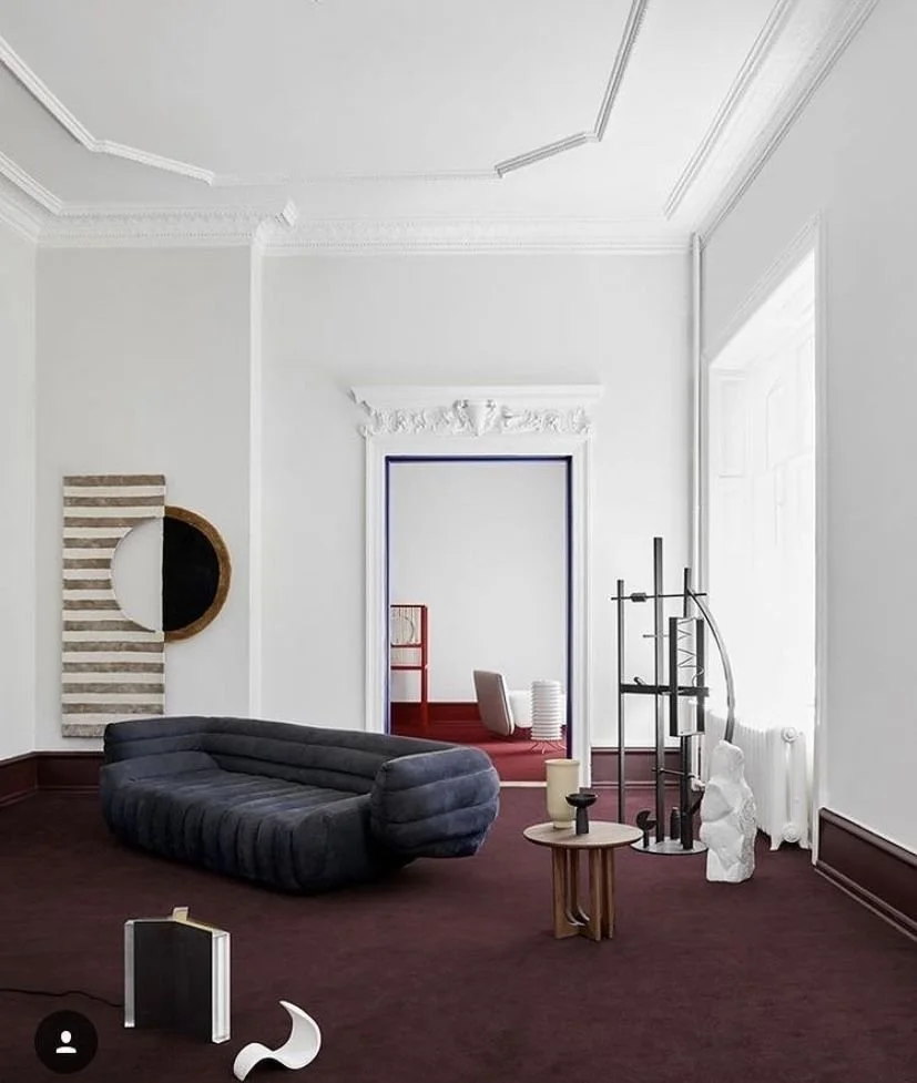
A room with one bold colour statement, held in a framework of clean lines and honest materials, is still simple. It is still restrained. But it is not empty. The colour was chosen. The material was selected. The space was considered.
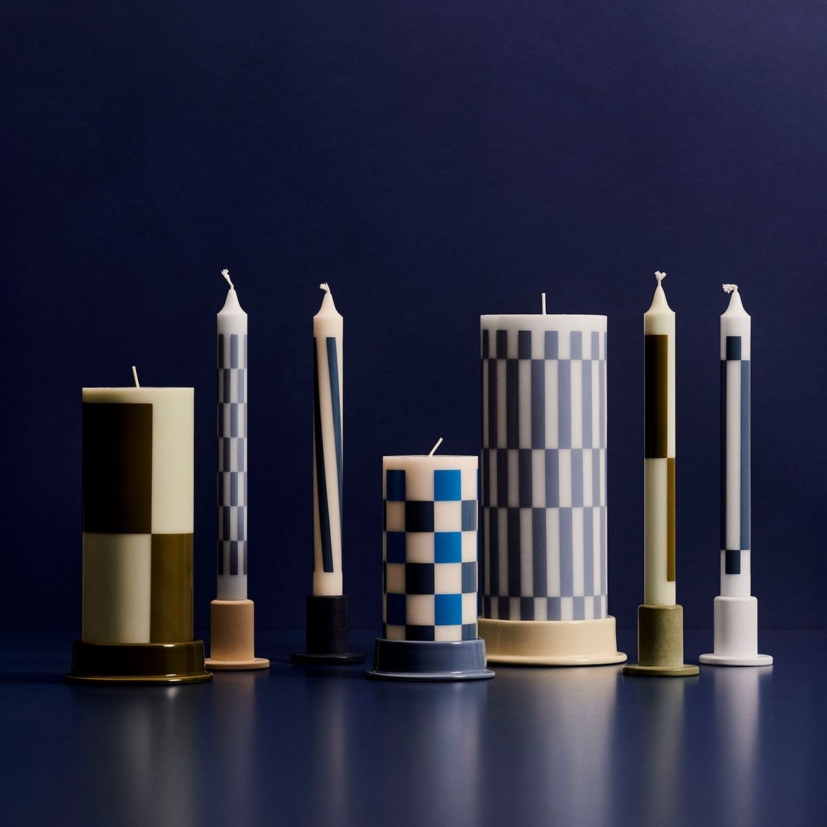
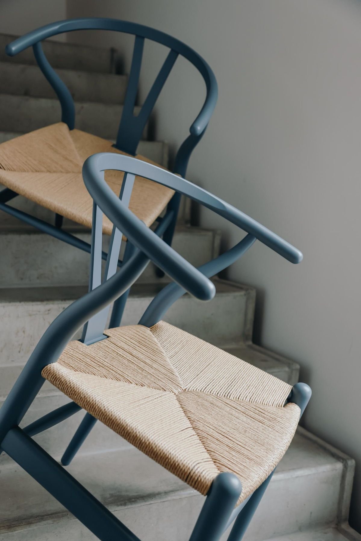
This is what is happening right now in Scandinavian design. Brands like Hay create storage crates in vivid yellow, made from recycled plastic. The form is restrained, the function is clear & the colour is bold. And somehow, all three elements coexist without contradiction.
A chair reissued from the 1970s is produced in celadon green with the same engineering precision as a grey version would be. The restraint is in the design, not in the colour. The minimalism is in the form, not in the palette.
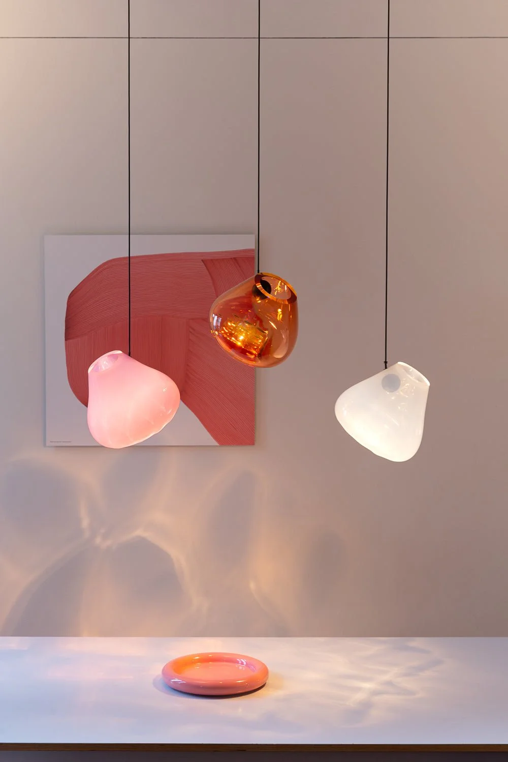
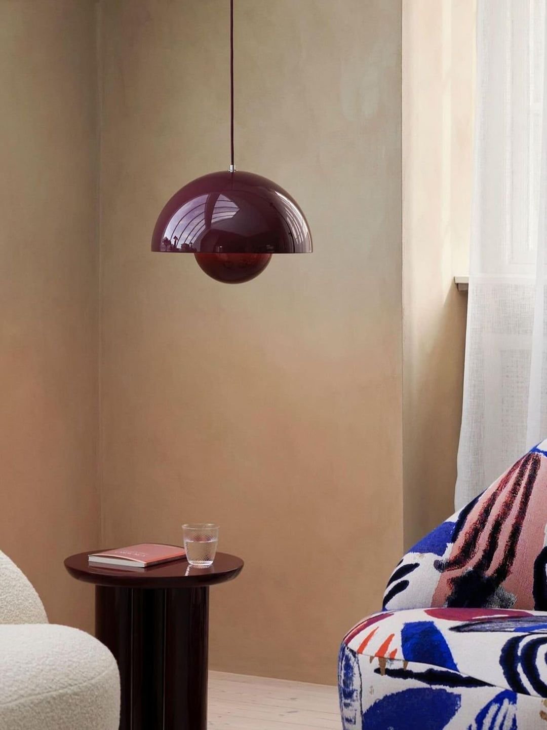
A lamp has formal, simple lines but warmth in its proportions. It does not need neutrality to feel calm.
What This Reveals About Simplicity
The revolution happening in Scandinavian design is revealing something important: simplicity is not the absence of colour. Simplicity is the absence of unnecessary elements.
One striking colour chosen consciously is more restrained than five safe colours chosen to avoid making a decision. A piece of furniture in a considered green, made to last, made with craft and care, is more minimal than something neutral and disposable. A room where every element is purposeful can hold colour without losing its clarity.
This distinction matters because it changes how you approach your own home. If simplicity requires emptiness, then the choice is stark: either you live with white walls and grey linens, or you abandon simplicity. This is a false choice. Contemporary Nordic designers are proving it is false. They understand that simplicity is about intention. Intention can hold colour.
The Sensory Shift
There is something in this shift that goes beyond design philosophy. It is sensory.
A room with restrained form but colour to look at, with simple materials but depth to feel, with quiet lines but boldness in the palette—this room offers something different than pure white minimalism. Your nervous system registers it differently. Light moves through it differently. There is something to see without the space feeling busy.
This is the gift of colour chosen with restraint. It gives your eye something to rest on. It gives your mind something to engage with. It does not overwhelm. It settles you in a different way than emptiness does.
Why It Matters Now
We are living through a moment when people are increasingly asking: how do I create a calm, intentional home without surrendering things I love? How do I create space for my life without creating emptiness?
Contemporary Scandinavian design answers this question. It says: you do not need to choose between simplicity and personality. Between minimalism and beauty. Between having nothing and having everything.
What you need is intention. A bold colour is acceptable if it was chosen consciously. An object is acceptable if it was made well and serves a purpose. A room is simple if every element in it justifies its presence.
This is not new thinking. This is the thinking of the original Scandinavian designers. But it is new permission.
The Walls Can Hold Colour
The implication of all this is quiet but significant. The walls do not need to stay white. The furniture does not need to hide. Not because minimalism is wrong, but because true minimalism was never about absence of colour. It was about clarity of purpose.
A wall painted a considered celadon or a deep cream or a soft grey-blue is still minimal if that colour was chosen for a reason. If it serves the light in that room. If it supports the feeling you want to create. If it is honest.
When you choose colour this way, not because you are running from white walls, but because you have considered what that room needs—something settles. The space becomes more itself. Less generic. More true.
The contemporary shift in Scandinavian design is not a rejection of Nordic principles. It is a fuller understanding of them. It is a return to the original thinking: that design should support the way you want to live. That simplicity and colour can coexist. That restraint does not require emptiness.
This is what it means to move beyond beige. At Lou Joia Studio, this is the kind of Scandinavian design we are interested in: calm but not empty, restrained but not lifeless, minimal but deeply personal.