Studying Mid-Century: Designing Greystones Through a Scandinavian Lens
Occasionally a project arrives that asks you to look at things differently. Greystones was one of those.
Scandinavian design is the foundation of Lou Joia Studio and the design language I return to most instinctively. I am continually drawn to its sense of proportion, its use of natural materials, its relationship with light and the importance it places on what is left out as much as what is included.
It is also a design language I am still constantly learning from.
Over the years, I have spent a great deal of time studying Nordic design, travelling to Scandinavia, visiting showrooms and observing the way Scandinavian designers work with timber, stone, colour, light and form. The more I study it, the more I realise how much depth there is within what can initially appear to be a very restrained aesthetic.
Greystones introduced another layer to that learning.
From our earliest conversations, my clients had a real appreciation for Mid-century design and wanted some of its warmth, character and confidence to be present within their home. Rather than simply selecting a few recognisable Mid-century pieces and placing them within an otherwise Scandinavian interior, I wanted to understand the movement more deeply: its architecture, furniture, materials, colour, proportions and, most importantly, the thinking behind it.
So for this project, I became a student of another design language.
Over the last few months, I have spent a great deal of time studying Mid-century interiors and revisiting the work of designers whose pieces I already knew, but had never examined through this particular lens. I wanted to understand why certain silhouettes feel so light despite being made from substantial materials, why deeper colours can still feel balanced, why timber carries so much emotional weight and why pieces designed more than half a century ago still feel entirely relevant today.
The more I studied, the more interested I became in just how closely the two design languages intersect.
Finding the Connection Between Two Design Languages
Both prize craftsmanship, natural materials and thoughtful proportion. Both design for living rather than simply for looking at, and both have an extraordinary respect for timber and for objects whose construction can be understood simply by looking at them.
They share a belief that function and beauty do not need to be separated, which is perhaps why so many pieces created during that period have remained relevant long after the trends around them disappeared.
The difference lies less in what the two movements value and more in how they express those values. Scandinavian design tends to give things more room. There is an ease and generosity around empty space, where the void surrounding an object matters almost as much as the object itself.
Mid-century design can feel more graphic and more confident, introducing stronger geometry, richer colour and materials with greater visual weight. For Greystones, I do not want one philosophy to overpower the other. I am interested in the space between them, and in allowing that tension to create something specific to this house.
We are not designing a Mid-century home, and I do not want it to feel like a recreation of an interior from the 1950s or 1960s. We are designing a contemporary family home in Ireland through the Scandinavian principles that guide Lou Joia Studio, while allowing Mid-century influences to introduce another layer of warmth, depth and personality.
What This Looks Like in Greystones
That thinking has influenced almost every material decision we have made.
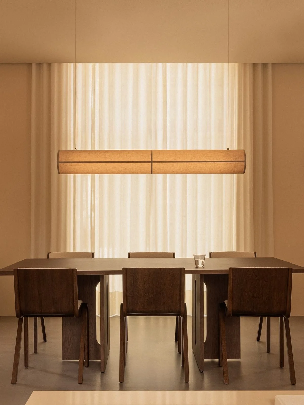
Timber is incredibly important. I am drawn to the richness Mid-century designers achieved with darker and warmer woods, and to the sense of depth they can bring to an interior. In the kitchen, the stained oak island introduces that warmth into an otherwise quieter architectural palette, while the Avocadus quartzite brings natural movement and character.
Because the stone already has such presence, the surrounding elements need to become calmer. I keep returning to that balance throughout the house: allowing one material or object to speak while everything around it gives it enough space to do so.
Colour has perhaps been the greatest gift of this project.
Burgundy, terracotta, olive, warm cream and deeper timber tones are colours I would normally use with considerable restraint, but here they have become part of the language of the house.
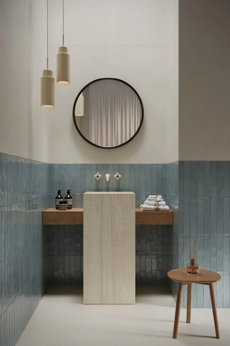
Mid-century design has given me permission to push the palette further, while Scandinavian thinking continues to tell me where to stop. That distinction matters to me because Scandinavian interiors are still too often reduced to white, grey and pale beige.
Restraint is not the absence of colour. It is understanding where colour belongs, how much visual weight it should carry and what needs to remain quiet around it. The ensuite has become one of my favourite examples of this thinking.
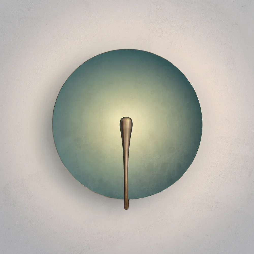
Terracotta and burgundy introduce warmth and personality, while the lighter surfaces around them keep the architecture calm and controlled. Brass catches the light without becoming decorative for the sake of it, and the terrazzo floor brings the palette together through subtle fragments of cream, olive, burgundy and terracotta.
The room feels expressive, but still considered.
Learning to Look Differently
Studying Mid-century design has also made me look differently at proportion and form.
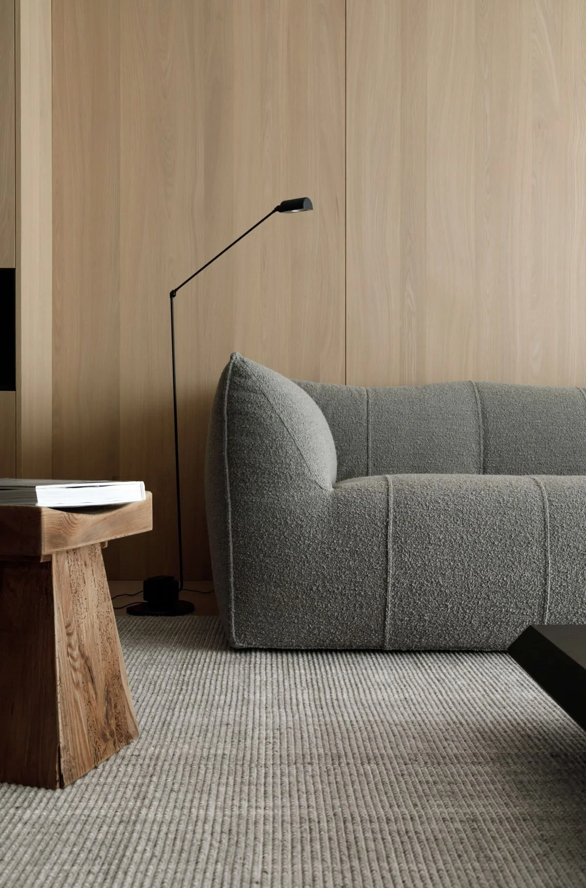
The best Mid-century furniture has presence without heaviness. Legs lift pieces from the floor, silhouettes feel deliberate, curves soften harder architectural lines and substantial materials are often held within surprisingly light frames.
There is a tension between weight and delicacy that I find particularly beautiful.
I am paying much more attention to those relationships in Greystones: where something should feel grounded, where it should almost disappear, where a curve can soften a stronger architectural line, or where a darker timber can introduce depth without dominating the room.
It has also reinforced something I believe strongly about interiors: a room cannot be designed by selecting beautiful objects in isolation.
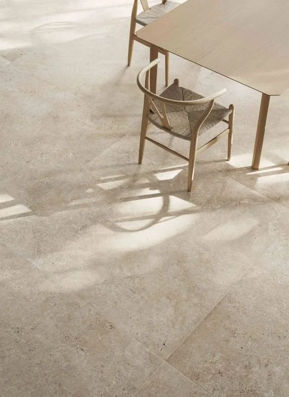
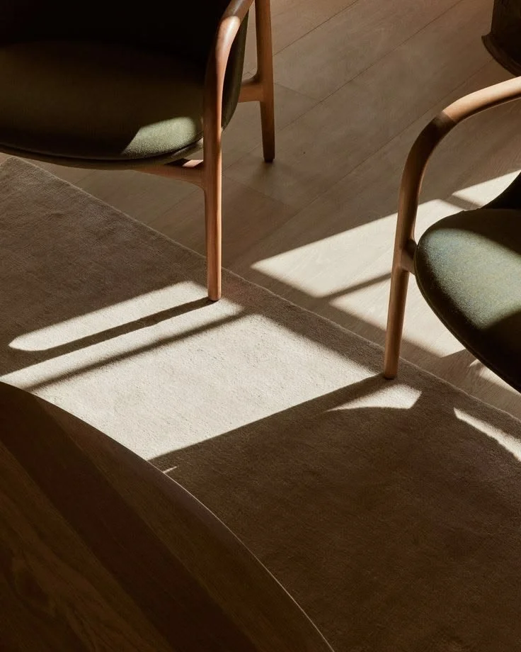
A chair may be extraordinary on its own, but what determines whether it belongs is its relationship with the rug beneath it, the light falling across it, the negative space around it and the architecture surrounding it. Inspiration works in much the same way.
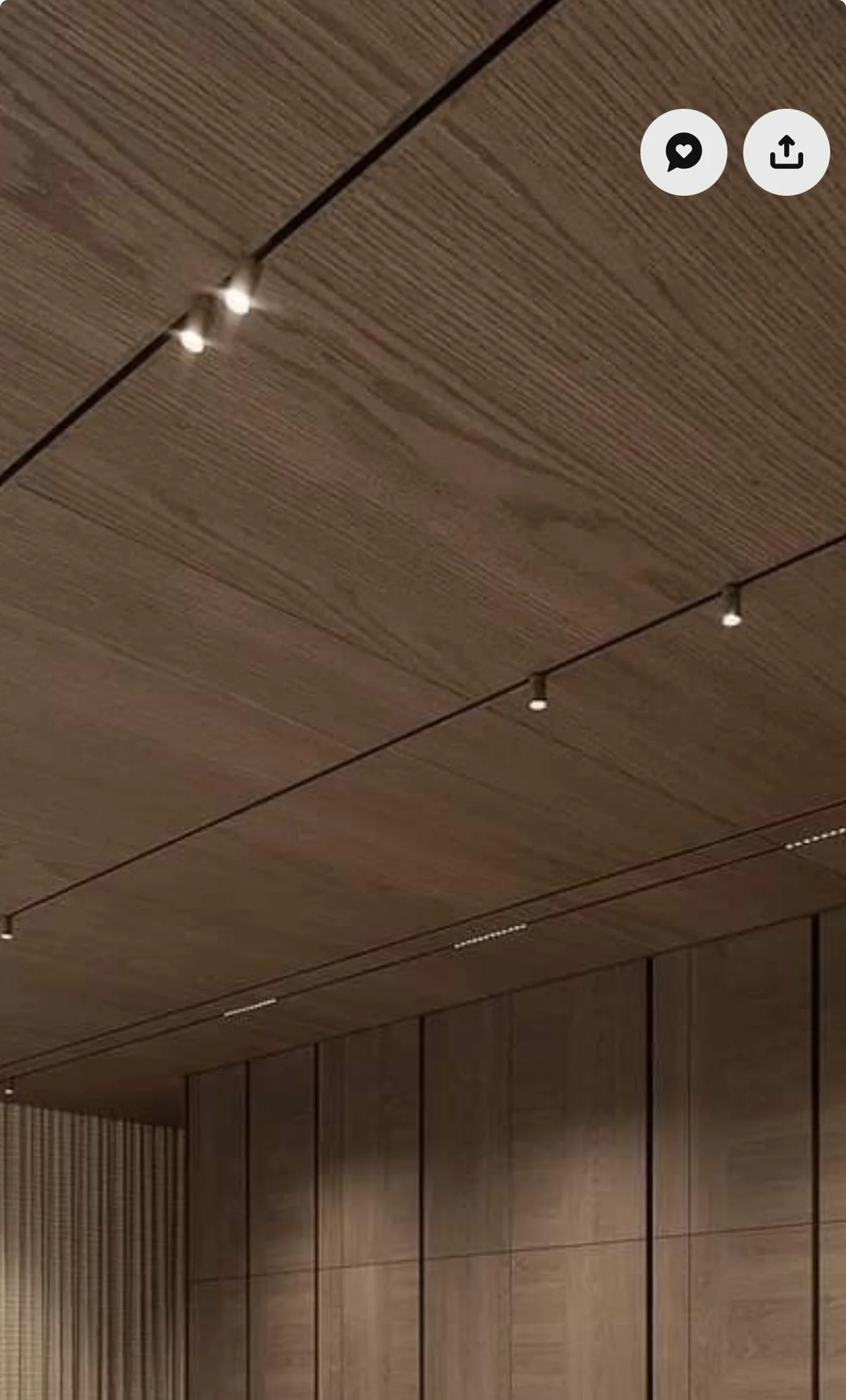
Sometimes a reference appears visibly in the finished space, but often its influence is much subtler: the proportion of a piece of joinery, the tone of a timber, the placement of a light, or the decision that one more object would actually be one too many.
Finding Greystones’ Own Language
As the project develops, I find myself becoming increasingly attached to it because it represents something I want Lou Joia Studio to continue doing: creating interiors with a clear point of view while remaining open enough to the people and architecture in front of us.
My clients brought their love of Mid-century design into the project and, rather than asking them to step entirely into my world, I have been finding a way for our perspectives to meet. My role is not to impose Scandinavian design onto their home, but to use the principles I believe in to create coherence around the things that already resonate with them.
The result, I hope, will resist easy categorisation: Scandinavian restraint beside Mid-century warmth, stone and timber in conversation, quiet architecture holding deeper colour, and contemporary elements sitting naturally alongside references to another era.
Above all, these are rooms being designed for a family to live in, not simply to be looked at. The objective was never to make Scandinavian design look Mid-century, or to make Mid-century design feel Scandinavian.
It was to understand both well enough to know what each could bring to this particular home.
And somewhere between the two, Greystones is beginning to find its own language.
The completed Greystones home, designed by Lou Joia Studio, will be revealed in 2027.