Preparing the Home for Autumn: A Curation for the Darker Months Ahead
There is a moment each year when the light changes and your home suddenly feels a little behind.
The brightness that carried us through summer no longer fills the rooms in quite the same way. The air shifts. Evenings begin to draw in. Spaces that felt effortless in June start asking for something different.
This is not a problem to solve. It is an invitation.
I felt it this week while standing in my closet, surrounded by linen throws and lightweight cushions that have carried us through the warmer months. It was time to shift. Not to discard, but to prepare. As I washed each piece, a small ritual of transition, I was also selecting pieces for clients' projects coming to completion as summer begins to turn.
This is where the real work begins: understanding that preparing a home for autumn is a conversation between what we already love and what the coming season requires.
Both for ourselves and for the homes we shape.
Autumn is perhaps when Nordic and Japanese design principles reveal themselves most clearly. Both cultures understand something we often forget in the modern world: a home is not static. It lives. It changes.
And when we move with the seasons rather than against them, something quietly profound happens.
The Japanese Principle of Mono No Aware
In Japanese aesthetics, there is a concept called mono no aware, an awareness of the impermanence of things and the beauty found within that concept.
Autumn embodies this completely.
The changing leaves, the shortening days, the subtle shift in how light falls across a room are not simply losses. They remind us to notice what is beautiful precisely because it will not remain the same.
Preparing your home for autumn is therefore not about chasing a new trend. It begins with observation, not purchasing.
Look at how the light moves through your rooms now. Notice which corners have become darker. Pay attention to where you naturally sit as the evenings lengthen.
For me, this meant pulling everything out. Every throw. Every cushion. The pieces that have lived on our sofas throughout summer, softened by use and faded slightly by sunlight.
I washed them carefully in cool water to preserve their texture before storing some away and bringing others forward. There is something grounding in that simple act.
These pieces have sheltered us. Now some rest, waiting for the season when they will be called back again.
Layers as Language
Both Nordic and Japanese interiors use layers as a fundamental language.
They are practical, a wool throw keeps you warm but they are also deeply intentional.
In Scandinavia, layering is part of how homes respond to long periods of darkness. Natural textures such as linen, wool and cotton are introduced gradually. A throw here. A cushion there. The effect is never overly styled. It is restrained and purposeful, grounded in the belief that every element should earn its place.
This week, I have been reorganising my own home with this in mind while curating pieces for several Lou Joia projects.
Not simply according to season, but according to intention.
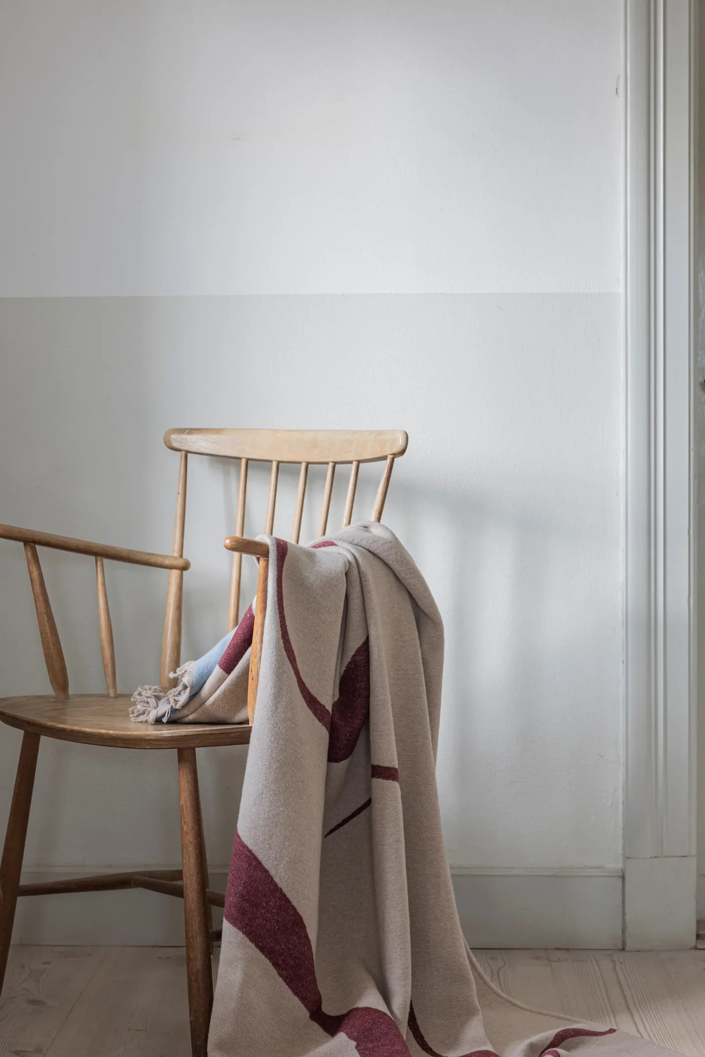
I have brought forward the Studio Throw in Wine by Mette Ditmer, available through Nordic Nest. Made from a recycled cotton blend, its graphic form and deep burgundy tone bring warmth without heaviness.
Wine is not a colour that needs to dominate a room.
Against pale upholstery, natural timber and soft neutral linens, it brings just enough depth to signal that the season is changing.
For a client's entrance, I have selected the Faded Noren rug by Linie Design in cream, a loom-knotted wool rug inspired by Japanese noren curtains weathered by sunlight and time. Its texture feels gently worn rather than pristine. It brings the space together without announcing itself.
That is perhaps what I love most about it. It will become more beautiful through use.
Storage That Holds Light
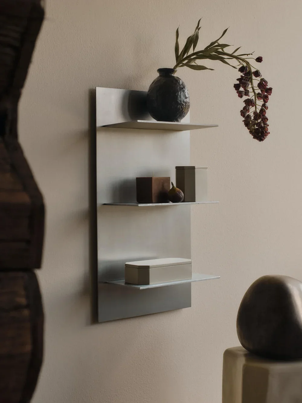
Storage should never be purely utilitarian. For one project, I have selected the Lager Wall Shelf by Ferm Living in brushed aluminium. Its vertical form and industrial lines are incredibly clean, yet against a pale wall the metal catches the changing afternoon light.
What initially feels cool and architectural becomes unexpectedly warm. It is a beautiful example of Nordic design's ability to transform a practical object through material and proportion.
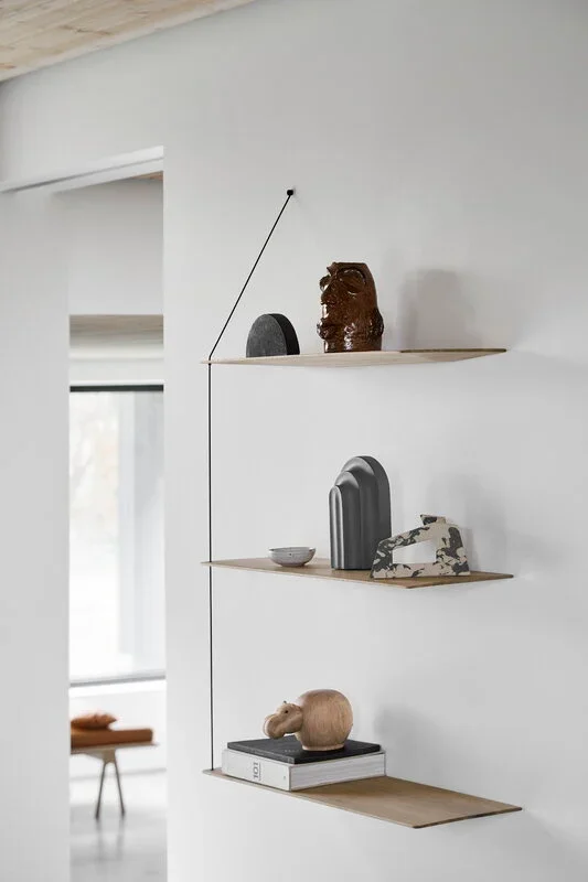
I am also using the Stedge Shelf by Woud in black. Where the Lager shelf reflects light, the Stedge creates an anchor. Against quieter walls, its dark structure gives objects somewhere to rest visually without making the room feel heavy.
The key is not to fill these shelves. Allow space around the objects.
Allow the eye somewhere to pause.
The Power of Darker Accents
Something happens when deeper tones are introduced into a light summer interior. It is not darkness. It is depth.
I have been bringing burgundy accents forward slowly. Burgundy does not need to announce itself. It has the richness of wine, the depth of the centre of a rose. It feels sophisticated without trying and warm without being obvious.
Against pale linen, natural wood and chalky walls, it grounds a space.
It quietly says: we are moving inward now.
Marble as an Investment in Impermanence
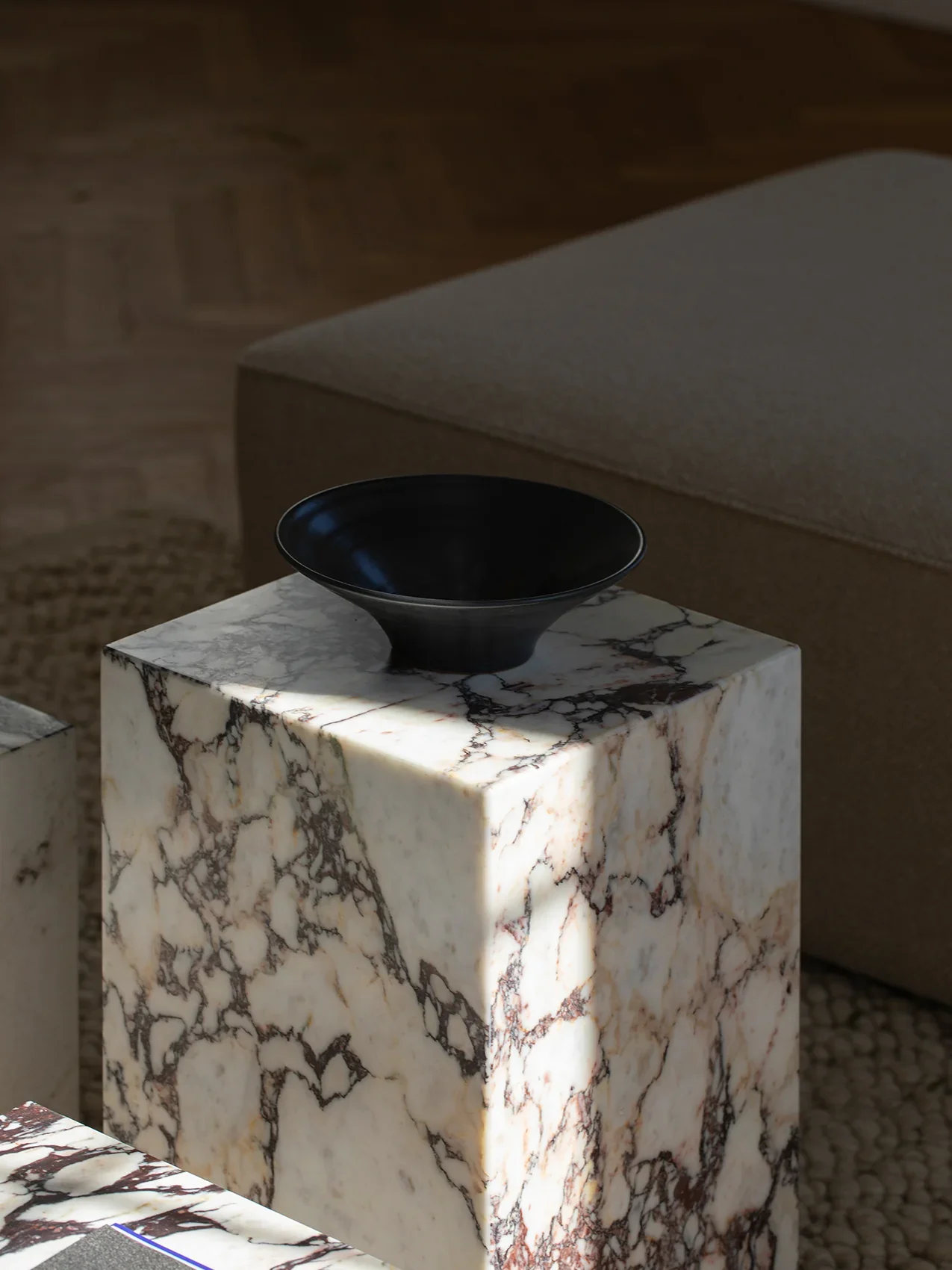
For a client's entrance, I have chosen the Plinth Tall in Calacatta Viola by Audo, designed by Norm Architects.
The marble has a pale base interrupted by dramatic veins of burgundy, purple and soft brown, almost as though the stone itself belongs naturally to the coming season.
It functions as a side table, but it is also an expression of something central to wabi sabi: the recognition that variation, irregularity and ageing are part of beauty. Every slab is different. Marble will change with time. It will develop a patina. Marks that initially seem imperfect eventually become evidence of a life lived around the object.
This is something I speak about often with clients. Invest in materials that can age alongside you.
Not things designed to remain artificially perfect, but pieces whose character deepens through time.
Light as Material
As the sun begins to sit lower on the horizon, the quality of light inside the home changes. It becomes more golden. More directional. Shadows lengthen.
Rather than fighting this with bright overhead lighting, I prefer to work with it. Nordic interiors have always understood this.
In countries where darkness occupies such a significant part of the year, light is treated almost as a material. Lamps are positioned to create atmosphere rather than simply brightness. Candles become part of daily life.
For my own home, I have selected the Filo Table Lamp in a black mirror-polished finish.
Its sculptural geometric form catches the surrounding light rather than flooding the room with it. The reflective surface becomes part of the illumination itself.
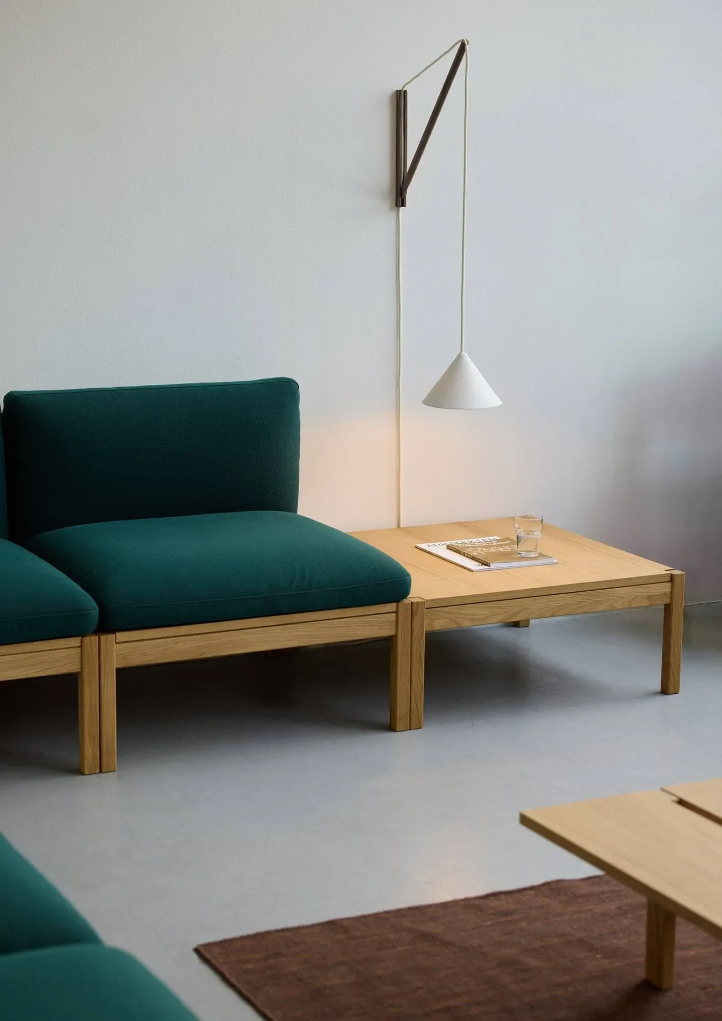
For another project, I have chosen the Moebe Suspended Wall Lamp, a beautifully floating gesture that creates soft illumination and delicate shadows.
These are not lights designed to illuminate everything at once. They create pools of warmth..
There is something deeply Japanese in this approach: the understanding that darkness does not always need to be eliminated.
The Ritual of the Everyday
Seasonal preparation does not have to happen through large gestures. Sometimes the smallest objects alter how a home feels.
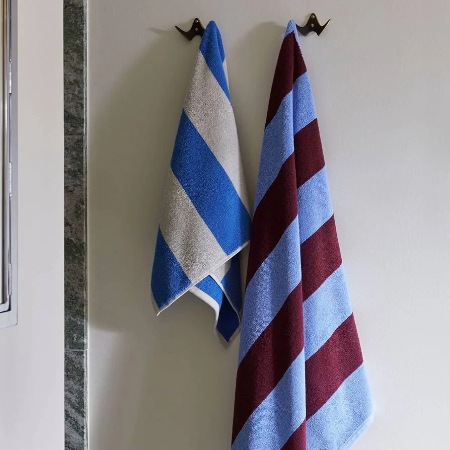
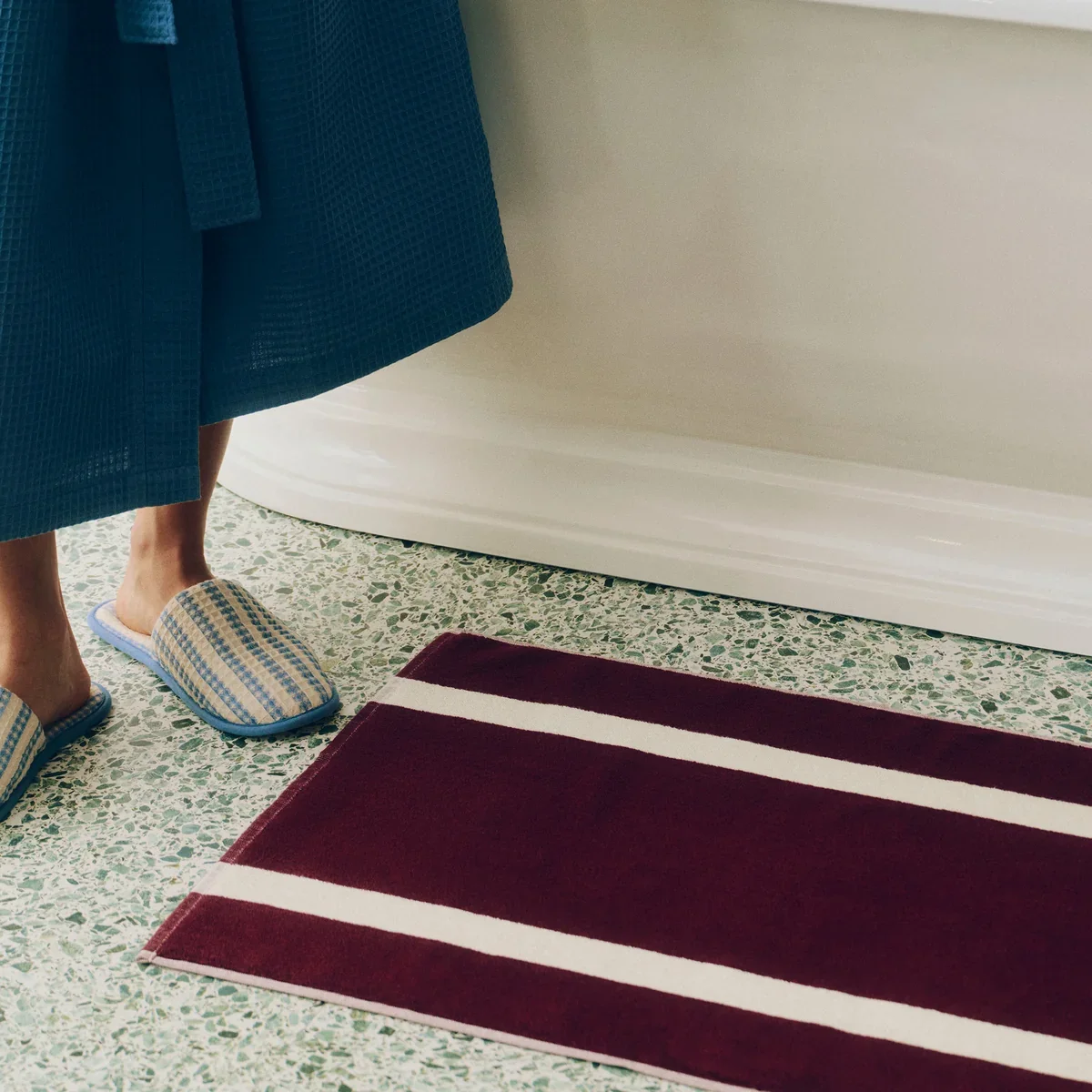
I have brought forward the HAY Stripe Bath Mat and Stripe Towels, simple textiles that remind us that a bathroom is not merely a utility space but somewhere we begin and end our day. There is something about stepping onto a beautiful textile on a cold autumn morning that subtly changes the experience of a routine.
Objects you may use every day without consciously thinking about them, until occasionally you notice the softness, the colour, the care that went into choosing them.
And for a moment, an ordinary ritual feels considered.
Scent as Atmosphere
Autumn is also about what cannot be seen. Scent creates one of the most powerful layers within a home because it works almost unconsciously.
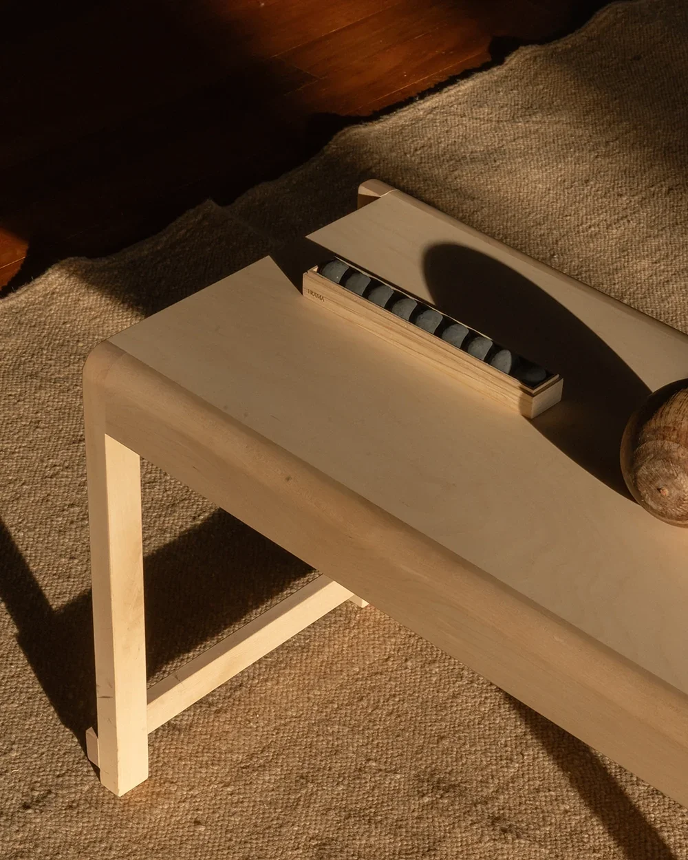
For the darker months I have selected the From Soil to Form Oil Diffuser by Frama Copenhagen, paired with Beratan Essential Oil.
Made from soil and air-enriching charcoal, its sculptural spheres sit inside a simple pinewood box. The Beratan fragrance is inspired by the volcanic landscape of Bali: warm, earthy, spicy and floral.
Over the coming months, scent can become an invisible thread through the home: something grounding, familiar and closely connected to memory.
The Threshold of a New Season
As I select the final pieces for projects coming to completion at the end of summer, I find myself thinking increasingly about thresholds.
The end of summer is one.
Moving into a newly designed home is another.
Both deserve intention.
One project brings together the Faded Noren rug, the Lager shelf, the wine-coloured throw, HAY textiles and the Frama diffuser. On paper, these objects do not necessarily “match”. And that is precisely the point.
They speak the same language instead: restraint, tactility, material honesty and the belief that fewer, more considered objects can create a richer experience of home.
Another project is anchored by Calacatta Viola marble, soft illumination from Moebe and the architectural simplicity of the Stedge shelves. Different pieces. The same philosophy.
This is the work of a designer as summer begins to turn: not simply decorating a space, but preparing it for the way people are about to live within it.
Ritual and Rhythm
There is something almost meditative about preparing a home for another season. Reorganising a cupboard. Moving a lamp because you suddenly notice where the evening light has disappeared.
These gestures are small. But together they create rhythm.
You begin to notice again what you own, what you love and what deserves to remain.
You are not replacing your home. You are allowing it to evolve.
The Quieter Season
When autumn arrives and a home feels genuinely prepared, not decorated for the season, but ready for it, something settles.
The outward energy of summer begins to soften. My own home already feels different.
Deeper. More held.
The darker accents do not feel heavy. They feel confident.
A way for a home to express what matters.
This is perhaps what Nordic and Japanese design have always understood so well: a home prepared for the season is a home that supports the way we actually want to live.
Autumn is not something that happens to your interior.
It is something you quietly prepare for.
And if you pay attention, you can almost feel the home settling into itself, ready to hold you through the quieter months ahead.